


DIY and Crafts
Classroom Decoration Ideas For PTM

Discover creative classroom decoration ideas for PTM to impress parents and students. Simple, budget-friendly designs that create a welcoming atmosphere and showcase student work effectively. Perfect for teachers!
Welcome to this article about classroom decoration ideas for Parent-Teacher Meetings (PTMs). Decorating your classroom for a PTM can be a fun and creative way to create a positive atmosphere for parents and teachers. After all, a good PTM is about building relationships between teachers and parents and providing a comfortable environment for both parties. In this article, we will explore some creative ideas for classroom decorations that will help make your PTM a success. We’ll discuss the importance of setting the right tone, choosing the right decorations, and how to make the most of your classroom decorations. Read on to learn more!
Classroom decoration ideas for Parents Teacher Meeting (PTM)
 Read More: Classroom Ideas For 2nd-Grade
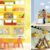
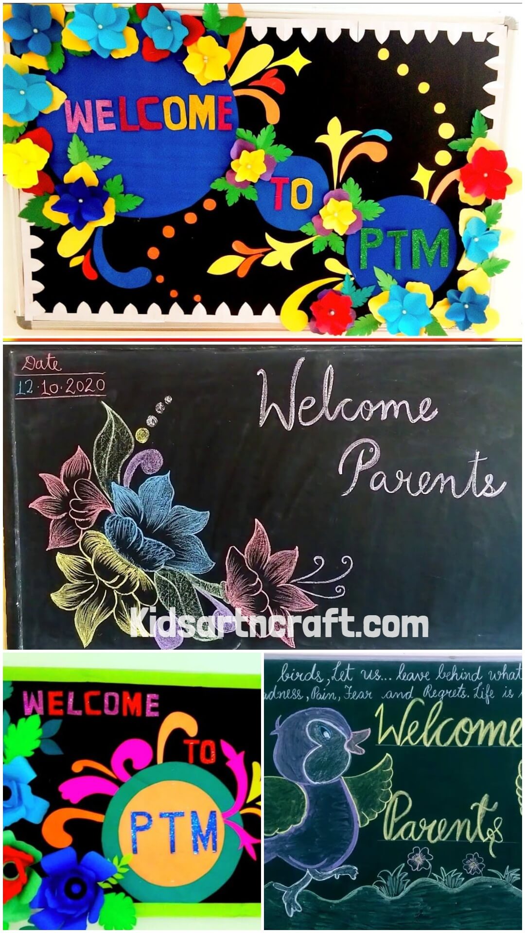
Easy-Peasy PTM Classroom Decoration Idea
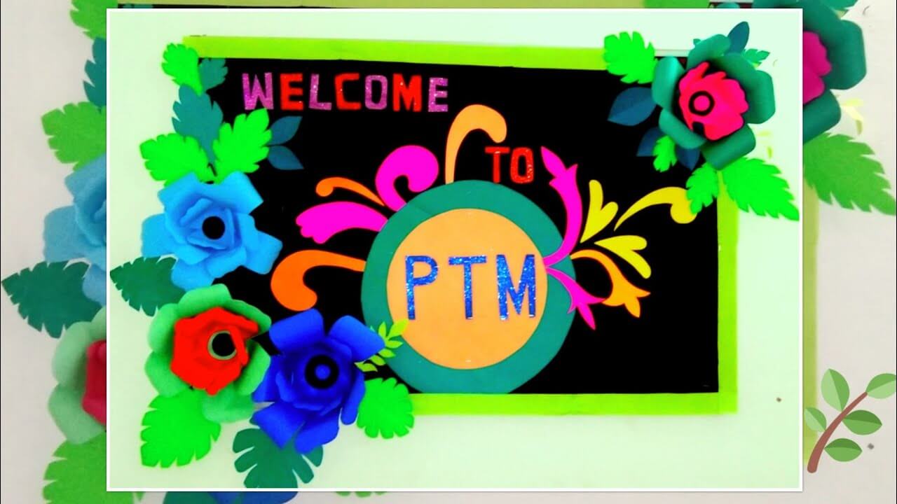
Image Source/Tutorial: Tik Tik Wow Creations
A good decoration is a perfect way to welcome everyone! This attractive PTM bulletin board flowery decoration idea can be a cherry on top for the meeting with students’ parents! Make these colorful flowers and leaves with colored papers and pin them over the bulletin board! This can be a perfect warm welcome idea for the school!
Easy & Fun Classroom Decoration Idea For PTM To Make
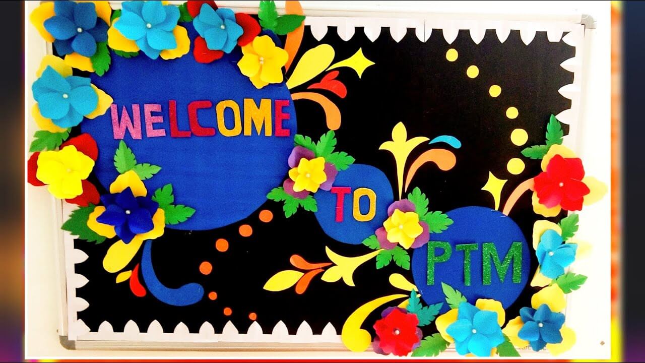
Image Source/Tutorial: Tik Tik Wow Creations
Whoa! Look at this stunning PTM decoration! It looks like a garden full of beautiful flowers is brought inside the room! Make this bulletin board in your PTM to stun everyone in the room and brighten up the room! It is fun to make, and the results will surely bring a smile to your face!
School Board Decoration Idea for PTM
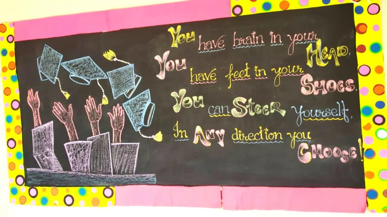
Make this motivating board by using just some colorful chalk over the blackboard! This amazing decoration is easy to make and will keep everyone motivated by the fact written over it! You can also use different colored chalks and another motivating fact to write on, using your imagination to make it unique!
Creative Blackboard Decoration Idea For Parent-Teacher Meeting
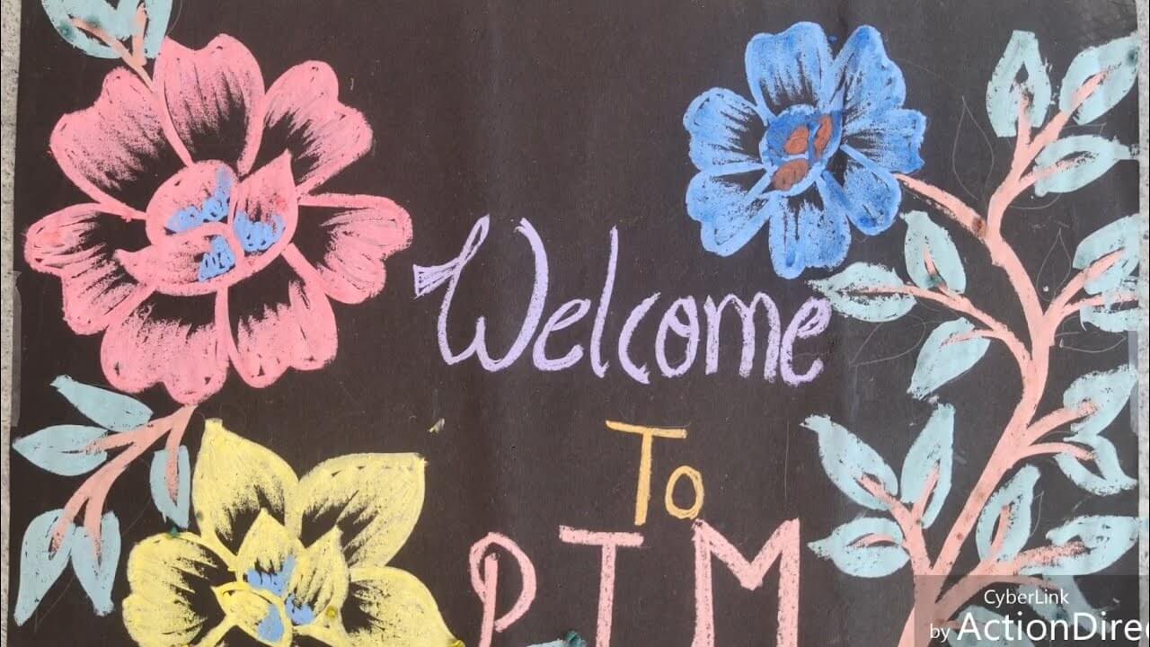
Image Source/Tutorial: Masti Ki Pathshala
This easy-to-make board decoration is fun and also less time-consuming! You can make this board on the day of PTM if you lack supplies and time! Colors you can choose of your own choice and preferences, and you can add on differences as you like, your imagination is the limit!
Easy-To-Make Blackboard Drawing Idea On PTM
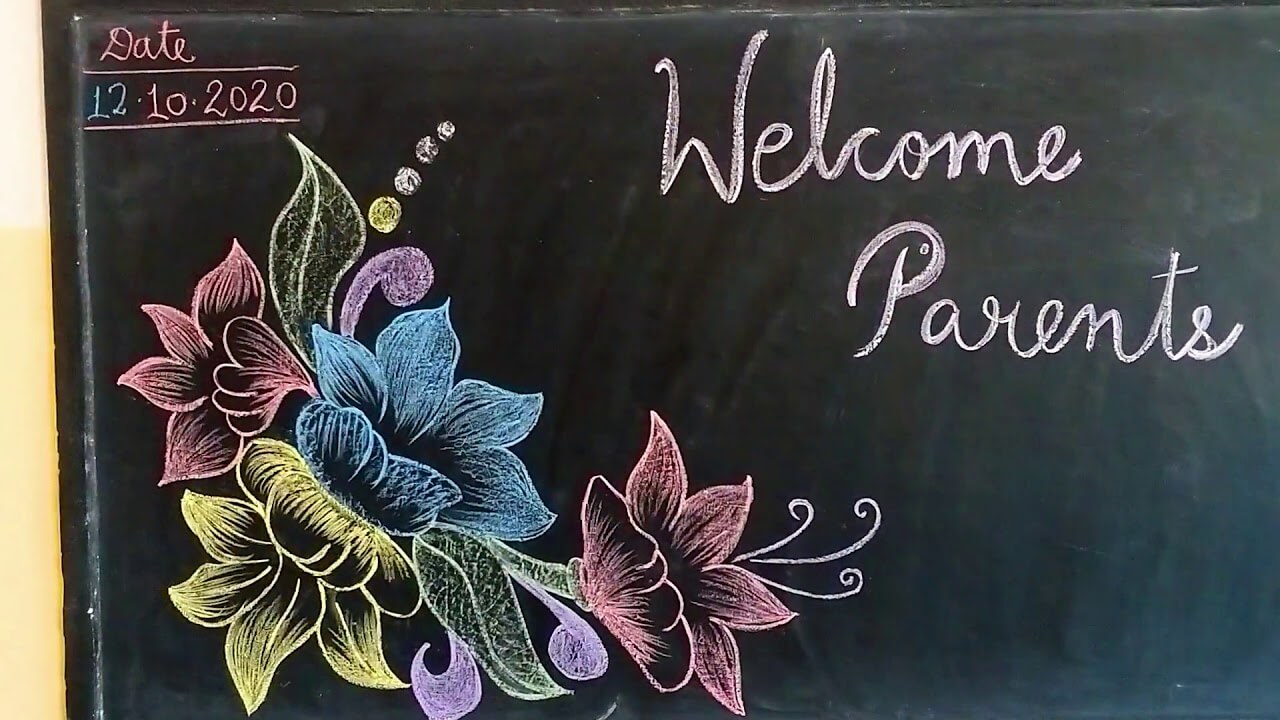
Image Source/Tutorial: Ambica Art & Crafts
Make this PTM decoration on the day to give a warm welcome to the parents! They will surely love it! This decoration will leave an impact on the parents that the school also focuses on children’s creativity and maintaining a good environment for studies in the class!
Read More: Simple Christmas Ornaments Crafts For Toddlers
Adorable Bird Drawing Blackboard Decoration Idea On PTM
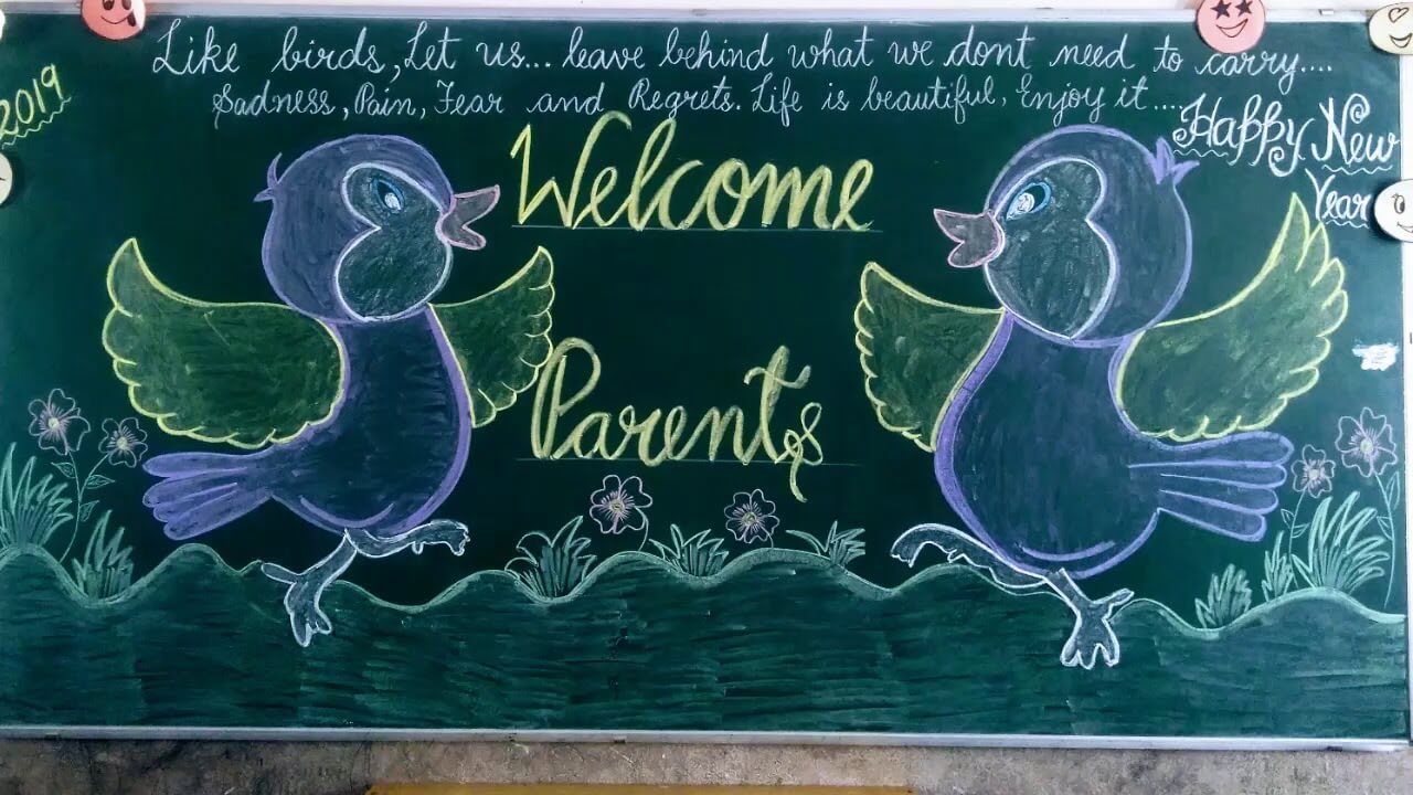
Image Source/Tutorial: Ambica Art & Crafts
Decorate the blackboard with the help of this PTM decoration idea to heartily welcome the parents of your students! This decoration only requires colorful chalks and a green board to decorate! The motivating fact will cheer up the students as well as the parents on the day! This will surely leave a positive remark!
Awesome Welcome Board Decorative Idea For PTM
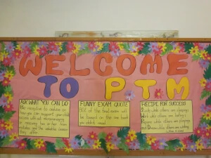
Create an awesome welcome board for your Parent-Teacher Meeting (PTM) to make a great first impression! Use colorful papers, markers, and decorative elements to craft a vibrant board. Include a warm greeting, schedule details, and fun visuals. This welcoming display will set a positive tone for the event and engage parents right from the start. Perfect for showcasing school spirit and fostering a sense of community!
FAQs Related to Creative Classroom decoration ideas for PTM
1. What colors are good for a classroom?
Colors can be a great way to create a welcoming and calming atmosphere in a classroom. Bright and cheerful hues such as yellow, light green, and light blue can help to energize students and create a lively environment. Deeper shades such as navy blue, forest green, and burgundy can be used to create a more subtle and sophisticated atmosphere. Neutral colors such as white, gray, and beige can be used to create a calming and relaxing environment. Whichever colors you choose, it is important to consider how they will affect the overall atmosphere of the classroom.
2. What makes a good display for the classroom?
A good display in the classroom should be organized and engaging. It should have a clear purpose, whether it be to introduce a new topic, reinforce a lesson, or celebrate student work. The display should be colorful and eye-catching, utilizing a variety of visual elements such as pictures, diagrams, charts, and other visuals that help bring the topic to life. Additionally, the display should be interactive, offering opportunities for students to interact with the material in creative ways. This can be done through activities, discussion prompts, or other material that encourages students to learn in a hands-on way. By creating a display that is both visually appealing and interactive, teachers can ensure that their students are fully engaged and can learn in a meaningful way.
3. What makes a good display for the classroom?
A good classroom display should be eye-catching and interesting while also being informative and educational. It should be organized and neat, with the material arranged in a visually appealing manner. The display should be relevant to the topic of study and should be accompanied by helpful information and resources. Colorful visuals, such as posters and images, can help attract attention and keep students engaged. It is also important to provide a way for students to interact with the material, such as providing a writing space or an opportunity to answer questions. Lastly, the display should be regularly updated to keep it fresh and relevant.
4. What color makes teachers happy?
Teachers often find themselves in an environment surrounded by a wide variety of colors. However, when it comes to the color that makes teachers the happiest, it’s probably green. The color green is a calming hue that encourages feelings of growth, balance, and harmony. It can also help to create a soothing, relaxed atmosphere in the classroom, which can help to create a more productive learning environment. Green is also a color that can represent energy, freshness, and renewal–all qualities that teachers strive for in their classrooms. Therefore, if you are looking to make your teacher happy, adding a splash of green to the walls or decorations can be a great way to achieve it!
5. Which color is most attractive for students?
When it comes to colors, there is no single answer to the question of which color is the most attractive for students. Each student brings their unique style and preferences to their wardrobe and may be attracted to different colors. That being said, some colors are commonly seen as attractive, such as black, blue, pink, and purple. These colors are often associated with comfort, creativity, and confidence, making them attractive to many students. Ultimately, the most attractive color for any student is the one that makes them feel confident and ready to take on any challenge.
6. Which color attracts the brain most?
The color that is most likely to attract the brain is blue. This is because blue is often associated with calmness and relaxation, which can be beneficial for the brain. Additionally, blue is a color known for aiding in concentration, making it ideal for tasks such as studying or work. Furthermore, research has found that blue can be associated with increased productivity and creative thinking, making it an ideal choice for stimulating the brain. Ultimately, blue is a great color to use when trying to attract the brain and get it into a more productive state.
7. What 3 colors go well together?
When it comes to colors, there are endless combinations that can be used to create a visually appealing look. Three colors that look great when used together are navy blue, white, and mustard yellow. Navy blue provides a strong base, while white creates a striking contrast and adds a sense of brightness. Mustard yellow provides a pop of color that helps to make the combination vibrant and eye-catching. These three colors can be used together in a variety of ways, such as on a wall or in a room design. They also look great when used on clothing and accessories. This trio of colors is a great way to add character and style to any space.
8. What colors attract the human eye most?
Colors are known to have a powerful effect on the human eye, which is why it is important to consider color when making design decisions. The colors that are known to attract the human eye most are warm colors like red, orange, and yellow. These colors evoke feelings of warmth and energy, which can be especially attractive to viewers. On the other hand, cool colors like blue, green, and purple are more calming and can be used to create a sense of balance and harmony. Ultimately, it is important to consider the effect of colors on the viewer when deciding on a color scheme.
By following the tips and ideas in this article, you can create a positive, welcoming atmosphere for your next Parent-Teacher Meeting. Setting the right tone and selecting the right decorations can help make your PTM a success and foster relationships between teachers and parents.
In conclusion, Classroom decoration ideas for PTM create a welcoming and engaging environment for parents and students. Simple, creative designs can showcase student work and school spirit. Use budget-friendly materials to make a lasting impression. Elevate your classroom’s look with these PTM decoration ideas, ensuring a positive and inspiring atmosphere for everyone!
Follow us on YouTube for art and craft tutorials and much more.
More Articles from Kids Art & Craft
- 8th Grade Art Project Ideas
- Sticky Note Teacher Hacks You’ll Want to Steal
- Christmas Tree Light Decoration Ideas
- X-Mas Indoor Games For Family And Friends
- Christmas Decoration Craft With Buttons